Solidus Design Update
Davide Di Stefano
28 Nov 2019 - 1 min read
Hey there! We just wanted to update you about the current state of Design in the Solidus ecosystem and give you a little preview about its future.
Rebranded Admin
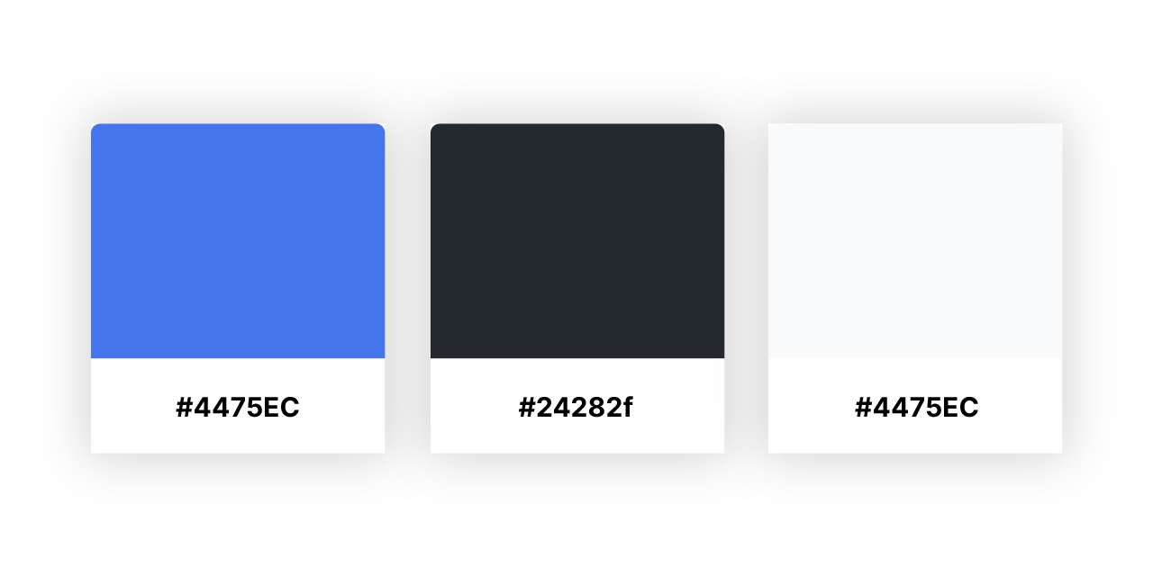
As you may have already noticed, in version 2.9 we finally updated the color palette of the Admin UI to a brand new one, which has already been in use on the solidus.io website for a while. This change comes from the aim to consolidate the Solidus brand and stand out from the competition. Another great new change is using Inter as default typeface on the admin. Inter is an Open Font similar to Roboto and Apple’s San Francisco, which was designed for user interfaces with focus on high legibility.
Collapsing Sidebar
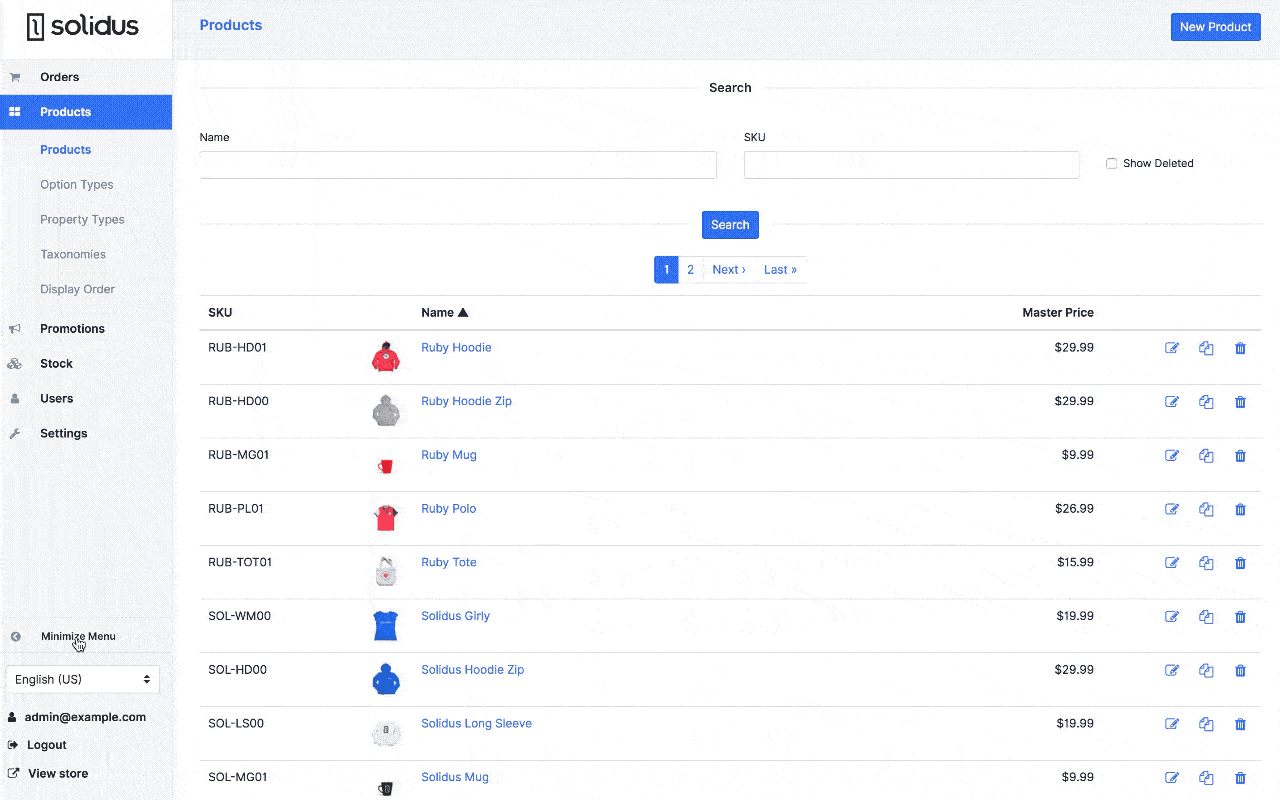
This long-overdue feature changed hands in its implementation over these years. Finally, thanks to the work of more than one contributor (#3322, #2961, #666, #2957, #1718), we can easily minimize the admin sidebar navigation and recover some lost screen real estate. This is the first step in achieving a more responsive and modern UI in Solidus.
Solidus Brand
We released a public repository with all the Solidus brand assets, so if you need to use the Solidus logo, please use those official resources. We plan to publish those brand assets, along with a revamped style guide, also on the official project website. Stay tuned!
What's next?
The next step is to follow the upcoming official roadmap, making design decisions based on a shared purpose and qualitative and quantitative data.